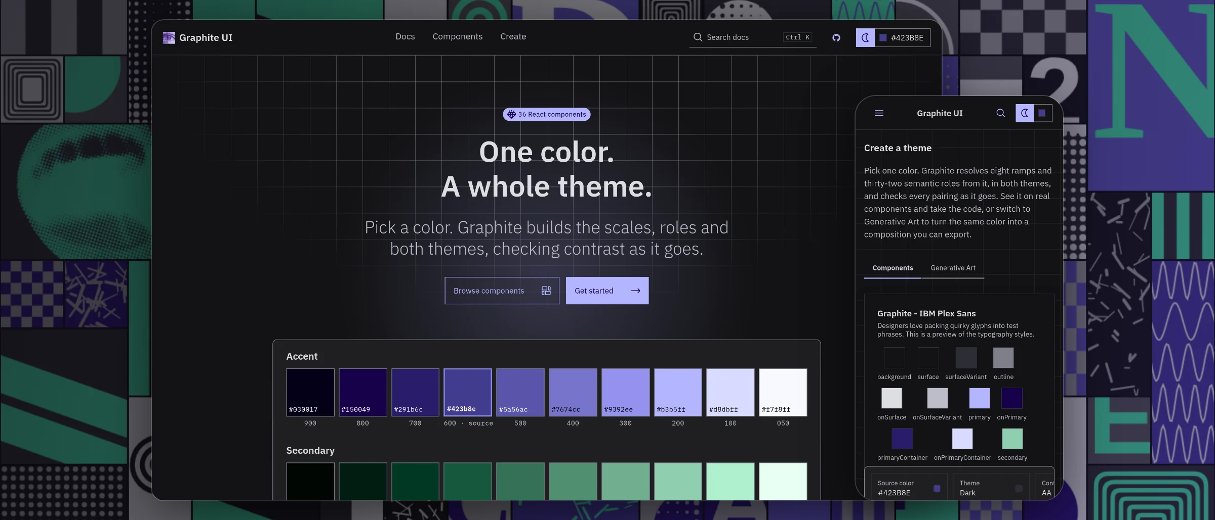
Graphite UI
I designed Graphite UI in Figma and built the code system behind it. One color becomes a tested light and dark theme, and every component answers to a written contract that CI checks.
The spec is the work
Graphite started with two ideas. IBM Carbon showed me how much rigor a system needs to hold up in code. Sol LeWitt’s wall drawings showed me that the written rules can be the work. Most kits with that rigor feel clinical. I wanted one with the same discipline and more personality.
LeWitt did not draw Wall Drawing #769 himself. He wrote the instructions, and a team of draftspeople followed them. The rules produced the output.
I took this photo in a museum in Tokyo, and it reframed the question for me. Can a design system be written so precisely that a designer, a developer or an AI tool following it produces the same result?
- Color roles generated from one source color
- 32
- Contrast pairs measured on every docs build, none below target
- 7,680
- Written component contracts, each versioned
- 37
- Automated checks that gate every change to the code
- 9
Rules first, then the art
The first thing I built was not a component. It was Generative Patterns, a grid engine that composes a new layout every time it runs. The first version was flat: eight tile types and no rules between cells. Each rule I added fixed one specific failure, and taught me how to write rules a system can follow.
Neighbor awareness
A tile can never sit beside its own type. The grid stopped clustering and started to breathe.
Twenty tile types
Eighteen drawn patterns and two halftone images, up from eight. More vocabulary meant more variety.
Variable spans
Panels span from one cell up to three by two. The grid gained hierarchy instead of reading as texture.
Zones
Each halftone image is seeded in its own band of the grid, so the images scatter instead of piling up at the top.
The 60/30/10 rule
Sixty percent gray, thirty percent the source color, ten percent its companion hue. Neighbors check each other to avoid clumps of one color.
One color, a complete theme
Everything in Graphite starts from one hex value. The engine builds eight color scales from it, then maps them to 32 named roles, such as primary, surface and onSurface, in light and dark. Designers and components choose roles, never raw colors, so a new source repaints everything without breaking how the colors relate.
Secondary is derived, not chosen
It sits 120 degrees around the color wheel from the source, at a little over half its intensity. One input stays one input.
Status colors keep their meaning
Danger, warning, success and info keep fixed hues and borrow only the source’s intensity, so red still means danger on any brand.
The tradeoff
A red source makes primary and danger look alike, and a near-black source has no hue to give its secondary scale. I documented both cases instead of special-casing them.
Contrast measured, not assumed
Contrast is checked while the theme is built, not audited afterwards. Every theme measures 20 text and border pairs against WCAG AA (4.5:1) or AAA (7:1). When a pair misses, the engine walks the same color scale to the nearest tone that passes, so the fix stays inside the brand’s own colors.
To learn whether that repair ever runs, I swept 96 hues through both themes at both levels. Not one pair failed. So I replaced the auto-fix toggle with a readout of the result: the toggle was a control with nothing to do. The repair stays in the engine for colors the sweep does not cover.
The sweep reruns every time the docs site builds: 7,680 pairs, none below target, none repaired. It samples one saturation per hue rather than every possible color, and the Accessibility page says so.
Rules underneath, personality on top
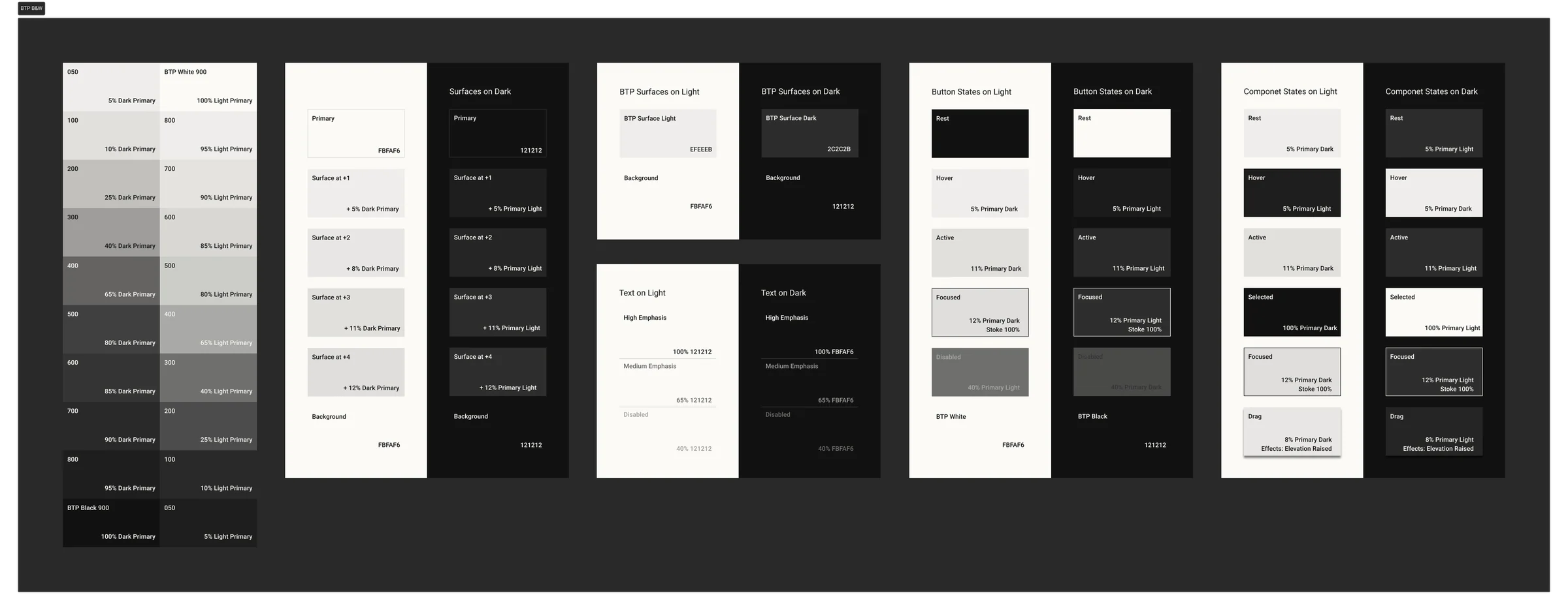
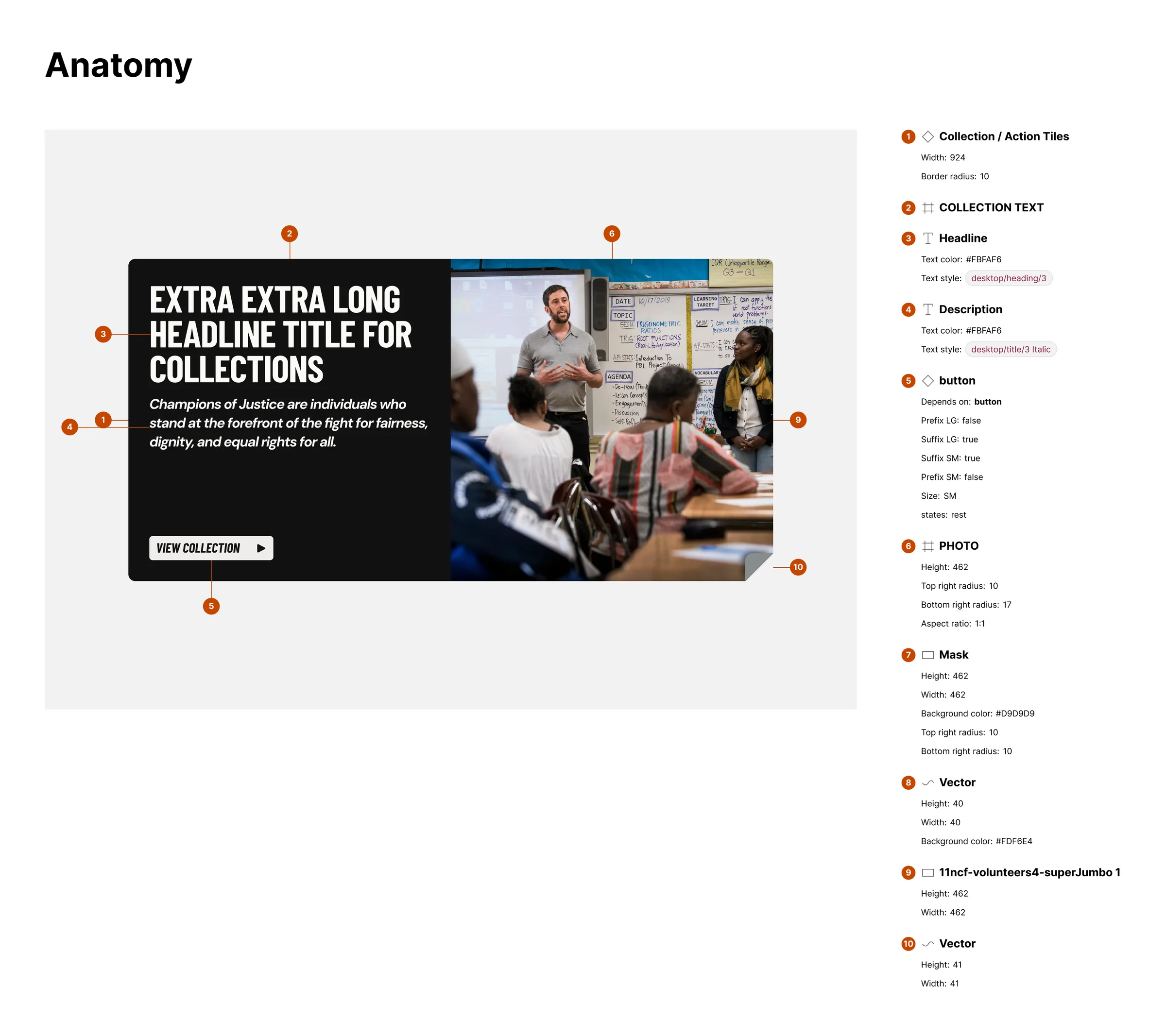
The kit began as IBM Carbon’s Figma kit, rebuilt on Graphite’s own variables in three tiers. Primitives hold the raw scales. Semantic variables hold the roles in light and dark. Theme variables bind them to components. On top sit the parts most enterprise kits leave out: pattern tiles, halftones and expressive type.
Semantic roles
88 variables with light and dark modes. 57 carry their CSS name, so Figma’s Dev Mode shows the exact variable a developer types.
Button
456 variants across style, type, size and state. Its description names the contract it answers to: button.md, version 2.7.0.
Read Me for people and AI
Every component page carries a machine-readable reference: variants, geometry, tokens, contrast ratios and when to use each style.
Pattern tiles
The tile vocabulary from Generative Patterns, kept as a foundation page beside color and type.
- Use semantic tokens, never primitives, for every fill and stroke.
- Design every screen in light and dark.
- Order variant properties as Style, Type, Size, State.
- Animate only to show where something came from or went. Nothing runs past 400ms.
Every component answers to a contract
A contract is a short text file per component. It lists the parts, the options, the color roles the component may read and what it must never do. Each carries a version number, and the Figma component names that version in its description. There are 37: one per component plus a shared overlay.
Button 2.7.0 appears in three places: the contract file, the Figma description and the header of its docs page. The contract changes before the code does, and changing a prohibition counts as a breaking change.
Checked on every change
Components read only the roles their contract declares. Foundations match a snapshot of the Figma variables. Docs match the kit’s component data. Button’s label pairs pass contrast. Every registry item builds and every code example compiles.
Checked by me
Visual parity with the kit, and the version stamps in Figma. CI compares code with a snapshot of Figma that I refresh, not the live file, because Figma’s variables API requires an Enterprise plan.
When Figma and code disagree
At first the contract was the source of truth, and Figma followed. In August 2026 I reversed that. Where the kit and a contract disagree, the kit wins and the contract is corrected. Contracts still gate the code. They describe the kit instead of outranking it, because the kit is what designers actually use.
Contracts first
Every component got a versioned contract, all marked canonical, and a drift check started holding the code to them.
The kit wins
Rule 7 made the kit canonical. Button took the kit’s square corners, Carbon’s asymmetric inset and a filled secondary.
A tie-break for the kit
When the kit contradicted itself, the more specific artifact won. Where it had no opinion, the code kept its own. Each call is written next to the value it explains.
Label, never delete
Carbon sets no contract claims stay in the kit, labelled ungoverned. Deleting from a published library breaks every file that uses it.
Install the source, own the code
There is no npm package. Graphite ships the way shadcn/ui does: a registry of source files that one command copies into your project. A theme is a URL with your color in it. You own the code, so no upgrade arrives that you did not ask for. The cost is that no update channel exists either.
Quick start is tested, not just written. A nightly job follows the rendered Quick start page in a fresh Next.js app, then checks in light and dark that the theme and fonts load and that axe, an automated accessibility checker, finds no A or AA violations. When it fails, it opens an issue rather than blocking a release.
This portfolio runs on Graphite
This site is the proof I live with. Its theme is the file Create generates for #423B8E, and its buttons, menus, tags and overlays were installed from the registry. No color here is hard-coded. Open the tray at the top right and pick any color: the whole site rebuilds from it, contrast included.
Specs a system can reason with
Building both sides taught me that a spec is only as good as what checks it. Writing contracts was the easy part. Keeping Figma, code and docs honest to them took CI, snapshots and a few reversals. Claude Code is part of my workflow, and the same specs that guide people guide it.
June 2026: Patterns
A generative pattern engine, built to learn how to write rules a system can follow.
August 2026: Engine and contracts
The color engine moved to Next.js, every component got a contract and CI started checking them.
August 2026: The kit wins
Precedence reversed, and the main branch became protected after one change skipped review.
October 2026: Parity and adoption
Every component matched to the kit, thirteen more built, and the registry opened to outside projects.
October 2026: Motion
The kit’s motion rules became tokens, and no raw timing was left in the code.
Keep: decisions written beside their values
Every tie-break sits next to the value it explains, so nobody “fixes” it back.
Keep: measure before adding controls
The sweep removed a toggle that looked useful and did nothing.
Reconsider: a hand-refreshed snapshot
CI checks a copy of Figma. A live sync, and automated version stamps, would close that gap.
Reconsider: owned code with no update path
A contract change never reaches code that was already copied. Adopters need a way to see what changed.
If you would like to see it work, pick a color in Create and watch the theme rebuild, or read the source on GitHub.