First Genomic Insights
Research, brand, design system and two website launches for a prenatal genomics startup, ending in a site that makes a first-of-its-kind test easy to understand.
World-class science, a placeholder website
First Genomic Insights was founded by three physician-scientists to bring genome-scale screening to prenatal care. Online, they had a placeholder page that could not support the conversations that mattered: investors, laboratory partners and future hires deciding whether this was a serious company.
A brand and system built to grow
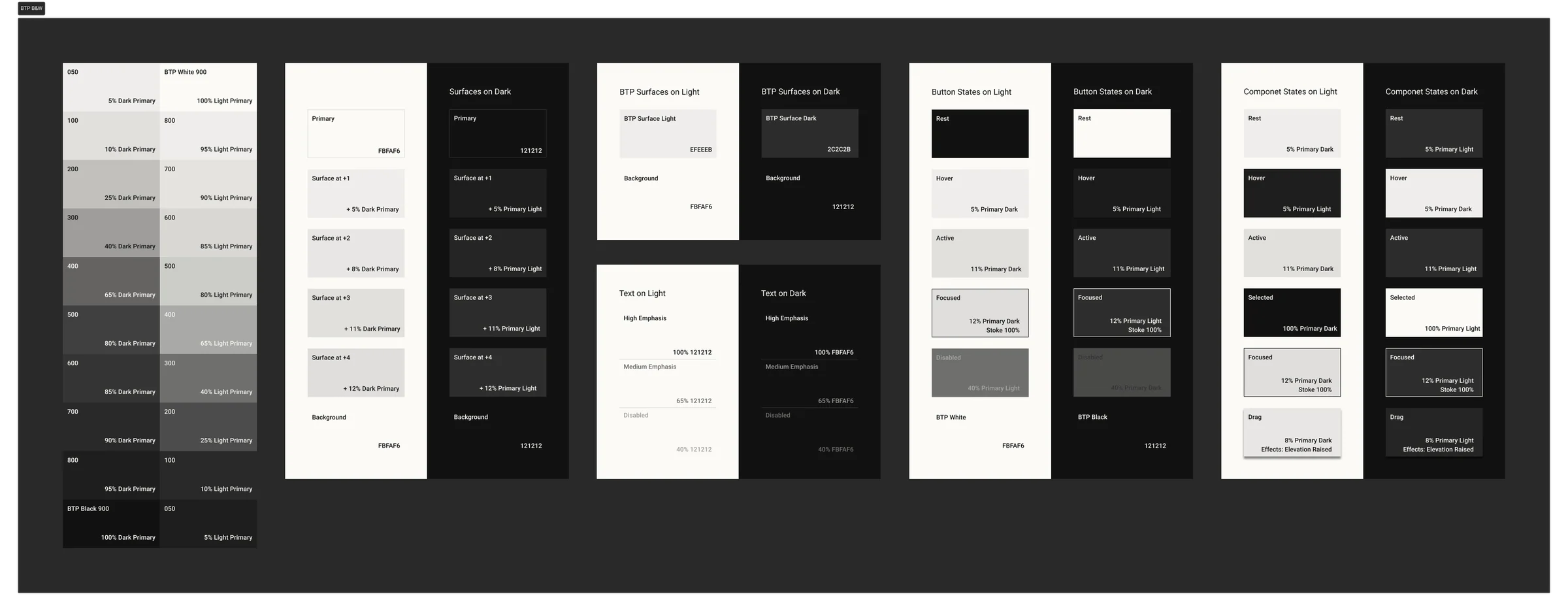
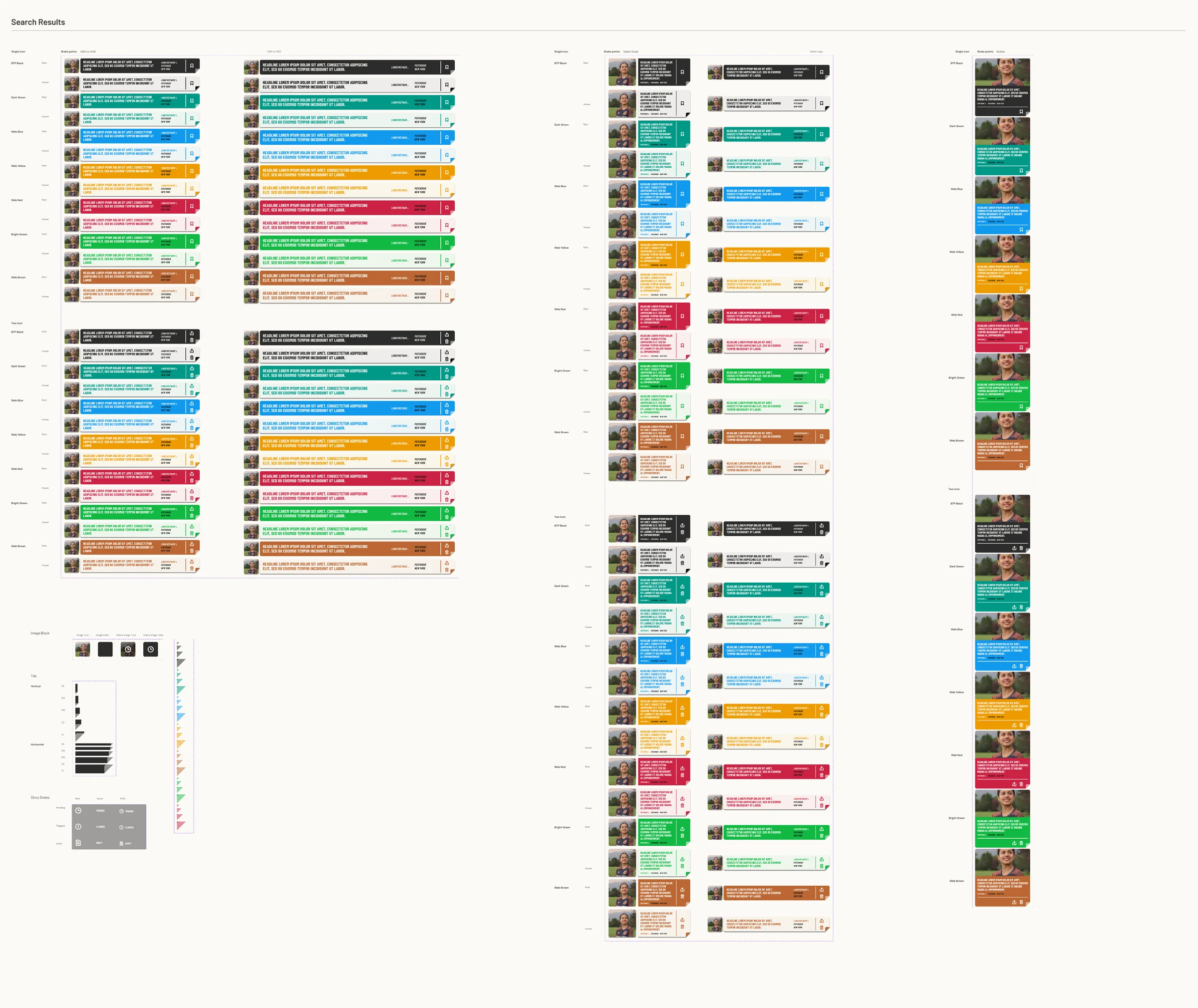
Built on interviews with the three founders and a study of eight brands across genomics and health. Three logo directions narrowed to one: a helix that is also an i, uniting mother, baby and genome. A calm teal palette checked to WCAG AA, a voice that explains before it persuades, and a variable-based design system gave every launch after it a head start.
Launch fast, then measure
The first site launched fast: four pages on the new brand that replaced the placeholder and established credibility, then gave us something real to measure.
What the first site taught us
With the first site live, I audited it page by page and wrote a UX assessment against each audience: content, information architecture and every path from first visit to first contact. Its findings became the brief for the new site.
- UX issues logged in the assessment
- 13
- Rated high impact
- 5
- Audiences mapped, each with its own journey
- 4
The biggest finding: one journey for everyone. Partners, investors, researchers and candidates arrive with different first questions, and the site answered none of them directly. So I mapped each audience from its first question to the action it wants, and gave each a route through the new site.
Clinical and lab partners
- Needs first
- What a partnership with FGI looks like
- Arrives asking
- Is it validated, and what does each side provide?
- Wants to
- Start a partnership conversation
Route on the new site
- Home
- How NIFS works
- Partnerships
- Lab inquiry
Investors
- Needs first
- What problem FGI solves, and why this team can solve it
- Arrives asking
- Who are the founders, really, and what stage is this?
- Wants to
- Request an intro
Route on the new site
- Home
- Screening timeline
- Leadership
- Investor inquiry
Researchers
- Needs first
- The scientific basis for the platform
- Arrives asking
- What has been published, and is there room to collaborate?
- Wants to
- Explore a collaboration
Route on the new site
- Technology
- NEJM publication
- Research inquiry
Prospective employees
- Needs first
- What FGI is building and why it matters
- Arrives asking
- What is it like to work there?
- Wants to
- Follow for openings
Route on the new site
- Home
- Our story
- Careers
Lead with the breakthrough
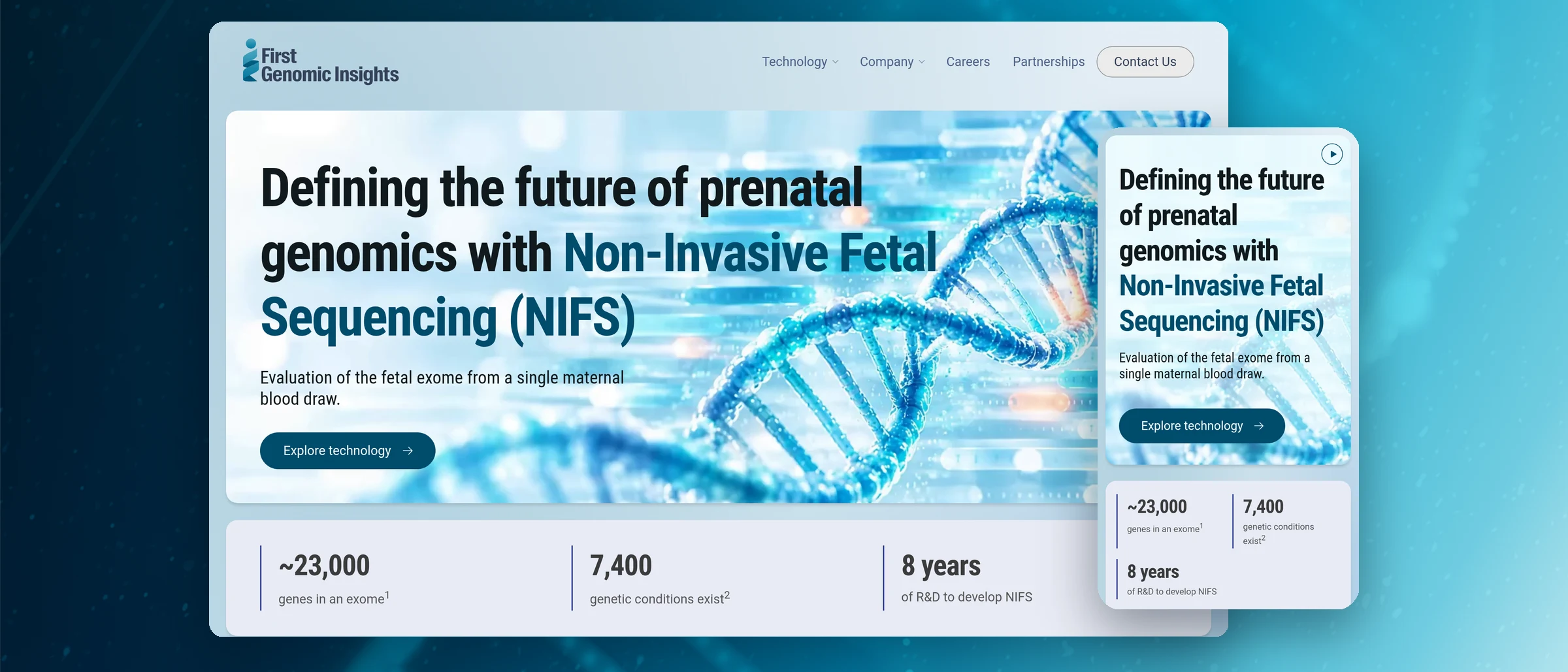
The new site opens on what makes FGI different: Non-Invasive Fetal Sequencing, the fetal exome from a single maternal blood draw, with the numbers that frame it. Then it answers the audit's first must-have: one clean, plain-language explanation of how NIFS works, and what it sees that today's prenatal tests miss.
Forty years of screening in one line
A timeline sets NIFS against what came before it, from serum markers in the 1980s to NIPT in 2011, on a single axis from low to higher resolution. A carousel then walks a sample through preparation, sequencing and analytics.
Every journey ends in proof
Each route on the map lands on a page built for it: Partnerships for laboratories, Leadership for investors, Publications for researchers, anchored by the proof-of-concept study in the New England Journal of Medicine. Contact then opens on the right form, so every journey ends in the right inbox.
The same story in one hand
Every section was designed for the phone as well as the desktop: the stats stack, the timeline reads top to bottom, and the carousel steps with a swipe.
Research first, then ship in two steps
Research defined the opportunity before design began, so every decision, from the mark to the system to the site, traced back to a gap in the market. Shipping a focused first site, then auditing it against real audiences, is what turned a credible website into a clear one.